


Segregated by Poverty, Penalized by Design: Racial and Economic Inequality in Howard County Schools
Black and Brown students are concentrated in under-resourced schools and the data shows the cost in academic outcomes.
Preface
The late Mahatma Gandhi once said “Poverty is the worst form of violence.”
As you sit and read this post today, ask yourself this question. If you see a child being physically or mentally abused what would you do? Would you stop it? Would you call for help?
If so, it is important for you to know that an entire generation of elementary school children’s fates are being sealed into a life of despair and continued poverty due to intentional and unintentional policy decisions by our county. This happens around us everyday.
The slow and gradual drip of underperformance and systemic underfunding of our schools robs these children of their future and condemns them to suffering. This is tantamount to physical and mental abuse. So why do we allow that to perpetuate? Why do we allow our government’s policy decisions to inflict pain and suffering?
Introduction
Since 2018, the Maryland State Department of Education (MSDE) has been publishing school report cards as part of the Maryland accountability system. The major components of the accountability system are called indicators.
At the elementary and middle school level, the indicators are: Academic Achievement, Academic Progress, Progress in Achieving English Language Proficiency, and Student Success.
At the high school level, the indicators are Academic Achievement, Graduation Rate, Progress in Achieving English Language Proficiency, Readiness for Postsecondary Success, and School Quality and Student Success.
The report card assigns possible points for each component. The earned points are divided by the possible points to determine the percentage earned points.
The Academic Achievement component is an aggregation of four subcomponents, two of which are separately reported. These are the percent of students scoring “proficient” or higher in English Language Arts and Math (ELA and Math Proficiency). The report card provides the results for all students and also disaggregates the scores by race.
In my previous post, I showed distributions of various metrics reported by the MSDE. I aggregate and present this data for elementary, middle, and high schools in the following dashboard:
The focus of this post is to investigate further the relationship of race, socioeconomic level, and scores at the elementary school level.
Specifically, since the MSDE reports overall school performance, the relationship of this overall performance to racial and socio-economic compositions is studied.
This analysis also examines Math and ELA proficiency scores disaggregated by race and socioeconomic composition to identify performance disparities across student groups.
Let’s start by looking at how the demographic composition of a school predicts the school’s overall performance score.
How do Certain Demographic Compositions of a School Predict Overall Performance Score?
Correlation of Racial Composition with Overall Performance Score
MSDE publishes the racial composition of each school. The four major racial groups reported are Asian, Black/African, Hispanic/Latino, and White with certain schools also reporting students of Native American origin. For privacy concerns, if the number of students of a certain race in a school were fewer than 10 the values were suppressed and not reported.
The racial makeup in the schools varies. For example, in 2024, the majority of students at Deep Run ES were Hispanic/Latino students, while the majority at Cradlerock were Black/African students and Worthington had majority White students.
Of interest is the relationship between the racial composition of each school and the overall performance of the school. The overall performance metric, which is the sum of the four indicators discussed earlier, is reported for the entire school and not broken down by race. However, it is possible to look at how the scores change as a function of race.

The years for which both racial demographic data and school performance data are provided are 2022 - 2024. The correlation heat-map in Figure 1 shows that schools with an increasing number of White and Asian students had higher scores (positive correlation), while schools with increasing numbers of Black and Hispanic students had lower scores (negative correlation).
This pattern aligns with longstanding research showing a correlation between racial demographics and socioeconomic status in school-level data. In addition to racial demographic data, the MSDE report card also provides the percentage of students from military families, economically disadvantaged families, those who rely on free and reduced meals (FARMS) and other student group populations.
A look at how the various racial demographic groups correlate with the percentage of student group populations in Figure 2, shows that Black and Hispanic students are strongly correlated with the percentage of students from economically disadvantaged families and those who rely on FARMS.
Inversely, Asian and White students are negatively correlated with FARMS percentage and percentage of economically disadvantaged students. In fact the degree of correlation of Black and Hispanic students with economically disadvantaged and FARMS is significantly stronger than the correlations for White and Asian students.

Regression Analysis of Overall Performance and Race
As we saw earlier, overall performance scores are provided for an entire school for all students while Math and ELA proficiency scores are disaggregated by race. While we are not able to disaggregate race- and other student group-specific scores from the overall performance metric, we can observe how overall performance scores change as a function of the percentage composition of a certain race or student group.
The linear regression plots in Figure 3 show the relationship between race and overall performance. The plots show that the higher the percentage of Asian and White students in an elementary school, the higher the overall scores. Inversely, the higher the percentage of Black and Hispanic students, the lower the overall scores.

Regression Analysis of Race and Income
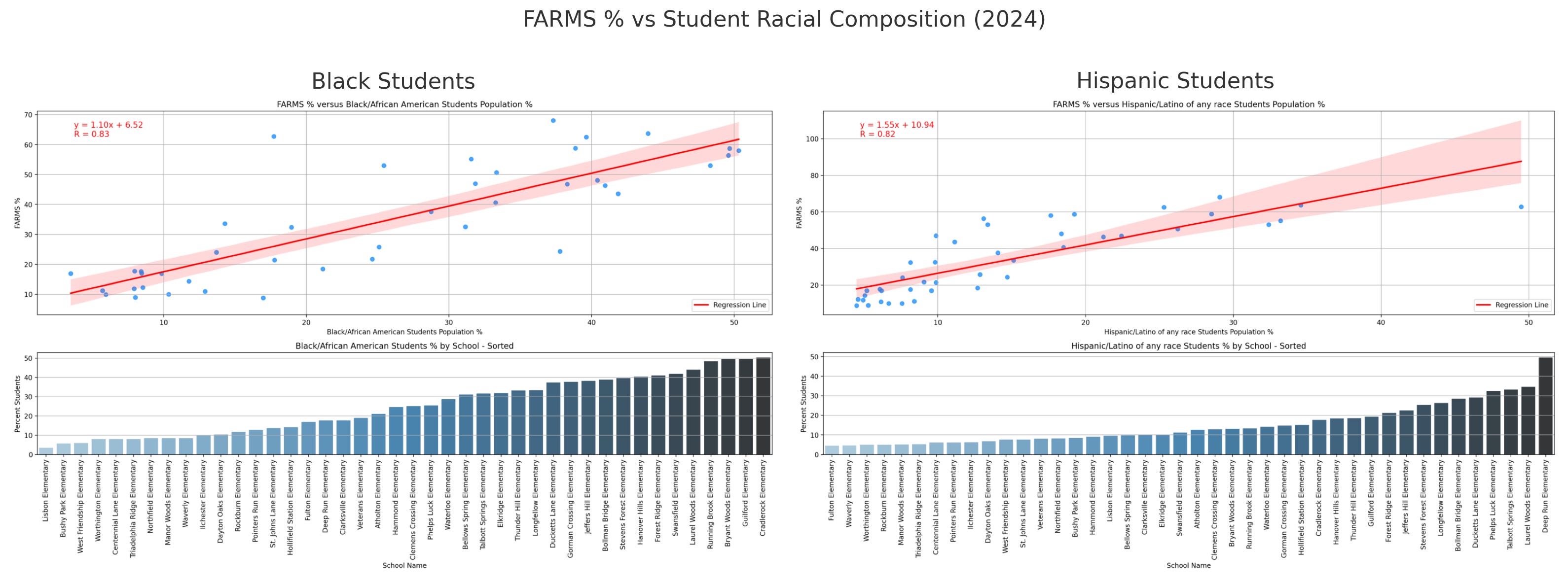
Socio-economic status is closely tied to educational outcome, which helps explain the negative correlation between the percentage of Black and Hispanic students and overall performance. The plots in Figure 4 show the strong linear relationship between being Black or Hispanic and poverty rate as measured by FARMS percentage.
MSDE differentiates students who qualify for free and reduced meals from economically disadvantaged based on certain criteria. Specifically, economically disadvantaged students are certified through federal programs once their families apply for programs such as SNAP and TANF, while those who qualify for free and reduced meals are also able to qualify by completing an application to demonstrate that their family size and income guidelines meet the requirements. The State definitions are presented at the end of this analysis.
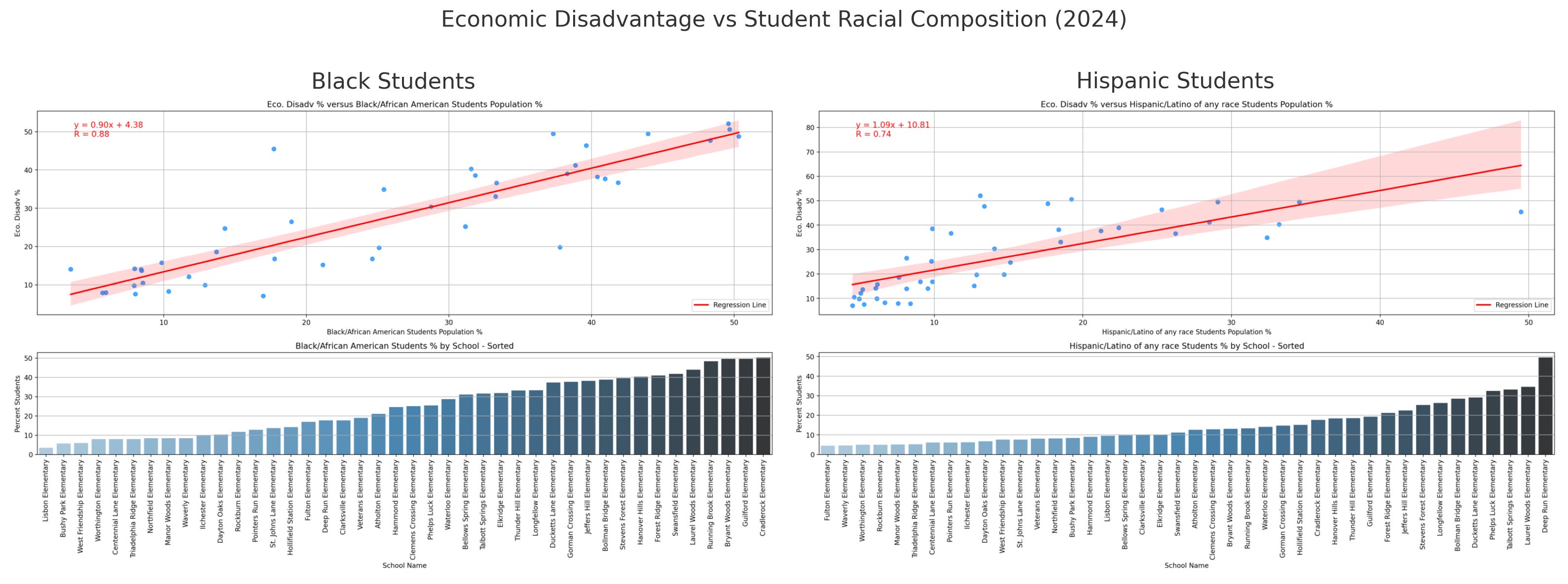
The State notes in a 2021 presentation that not all students who qualify for free and reduced meals are considered economically disadvantaged. While it is possible to perform this analysis using just one of the measures of poverty-level, both measures are evaluated. The trend-lines in Figure 5 show that economic disadvantage is also strongly correlated with race.
The next figure contributes to the picture by providing a linear regression between socio-economic status and overall performance. The linear regression results in Figure 6 show that schools with a higher percentage of economically disadvantaged students and students who rely on free and reduced meals scored lower. The impact of socioeconomic level on educational outcomes is well-known and these two trend-lines highlight the elementary schools where children are facing significant challenges.

The correlation heat map in Figure 7 shows the relationship of various student groups with overall school performance for the years that both sets of data were available - 2022 through 2024. Note the degree of correlation of the measures of poverty to overall school performance.

How Do Students of Different Races Perform in Schools with More or Fewer Low-Income Students?
As a preliminary matter, the chart below shows the proportion of students of racial categories in each of the 42 elementary schools for 2024. The red triangles mark the schools where FARMS percentage is higher than the median for that year. It is evident, with some exceptions, that the FARMS percentage of schools with majority Black and Hispanic students are above the median value.

A t-test helps us see if the difference between two group averages, like test scores, is meaningful, or just noise. A box plot (also called a box-and-whisker plot) is a visual way to represent the distribution of a dataset using five key values: the minimum, first quartile (Q1), median (Q2), third quartile (Q3), and maximum. These values provide insights into the central tendency, spread, and potential outliers within the data.
In this section, the t-test is used to investigate whether there are any significant differences in Math proficiency scores of a certain demographic within schools of high and low concentration of poverty. This is done by first splitting the 42 elementary schools in two groups by placing schools that fall below the median FARMS percentage into a “Low FARMS” group and those that fall above the median into a “High FARMS” group.
Next, the mean Math proficiency scores of the two groups - Low and High FARMS groups - are compared to assess whether there is any significant difference between the two values. Given the difference between the two mean values, the probability that these values are indeed different is compared to a predetermined significance level.
The plots in Figure 9 provide the results along with the box plots to illustrate the differences between the two groups as well as the tendency of the data within each group. The plots show that for every race, the Math proficiency scores in schools with low concentrations of poverty are higher than those with high concentrations of poverty.

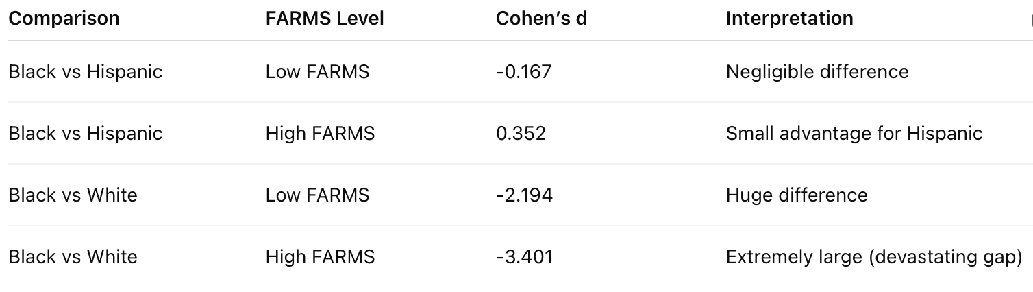
Cohen’s d is a measure of effect size that quantifies the magnitude of the difference between two group means, expressed in terms of standard deviations. While the t-test analysis shows that there is a significant difference between the two mean values, the Cohen’s d metric helps us understand how large that difference is.
In the context of this analysis, Cohen’s d reveals two important things: First, it quantifies the degree of difference between two mean values. The effect sizes fall into five bins signifying small effect size (0.2) to huge effect sizes (2.0 or more). By effect sizes, we mean how large of a difference. Second, we can compare across two groups by comparing their respective Cohen’s d values to gain a better understanding of the relative disparities of one group of students versus another group.
The effect sizes for the above t-tests are shown in the table below. The effect sizes show that Black and Hispanic students perform significantly worse in schools with a high concentration of poverty than White and Asian students.

As we saw earlier, economic disadvantage and FARMS are closely related. The MSDE data provides Math proficiency scores for students under the economically disadvantaged category, which are used to perform the t-test and compute the Cohen’s d metric. The plot in Figure 10 shows that economically disadvantaged students do better in schools with lower concentration of poverty. The Cohen’s d effect size is -1.504, which indicates a very large effect of the concentration of poverty of a school on scores.

The next set of box plots present a comparison of Math proficiency scores by race in schools with low and high concentrations of poverty. Specifically, the first two plots compare Black and Hispanic Math proficiency scores in high and low FARMS schools, respectively, while the second two sets show Black and White Math proficiency scores in high and low FARMS schools.

The results show that the Math proficiency scores of Black and Hispanic students attending schools with low or high concentrations of poverty are not significantly different. Meanwhile, the Math proficiency scores of Black and White students attending schools with low or high concentrations of poverty are significantly different. The effect size table below shows the degree of difference.
Implications
One major apparent implication of the analysis is that reducing the average poverty level of a school as measured by FARMS percentage is strongly associated with improved school-level educational outcomes. This means that the county should make significant efforts to reduce the FARMS percentage at elementary schools and have a plan to maintain them at or below that level to help achieve better school-level educational outcomes. Note that this analysis does not show student-level educational outcomes.
Studies that look at school performance usually focus on how the school system conducts redistricting or resource allocation within the school system. While this is important, it is critical to also look at, and perhaps place more focus on, the impact of a county’s zoning and land-use policies that actively contribute to economic and racial segregation of schools.
Next Steps
In a follow-up post, I will provide policy recommendations, including excerpts from my testimony to the Adequate Public Facilities Ordinance (APFO) review committee.
Miscellaneous Definitions
Free/Reduced Price Meals: The number and percentage of students whose applications for free/reduced price meals meet the family size and income guidelines (as promulgated annually by the U.S. Department of Agriculture) and students approved through direct certification. The counts are reported as of the student's last day of enrollment in the school system - either the last day in school or the date the student withdrew. The percentage is calculated by dividing the number of students receiving free or reduced price meals by the June net enrollment.
Economically Disadvantaged: For the accountability system, Maryland defines economically disadvantaged as any student identified as directly certified. Direct certification allows school systems to certify students as eligible for free meal benefits using participant data from other means-tested programs (as permitted), eliminating the need for an application.
Hi Hiruy! I'm on a curriculum committee for PTACHC - and have gathered a lot of data myself for the MCAP testing since 2016. I would like to add in some of the data you've shared in this article and your MSDE dashboard. Let me know if you'd be willing to share the database file you've made to generate these. My email is hsesptarep@gmail.com. Thanks!
Hi Hiruy! I'm on a curriculum committee for PTACHC - and have gathered a lot of data myself for the MCAP testing since 2016. I would like to add in some of the data you've shared in this article and your MSDE dashboard. Let me know if you'd be willing to share the database file you've made to generate these. My email is hsesptarep@gmail.com. Thanks!